
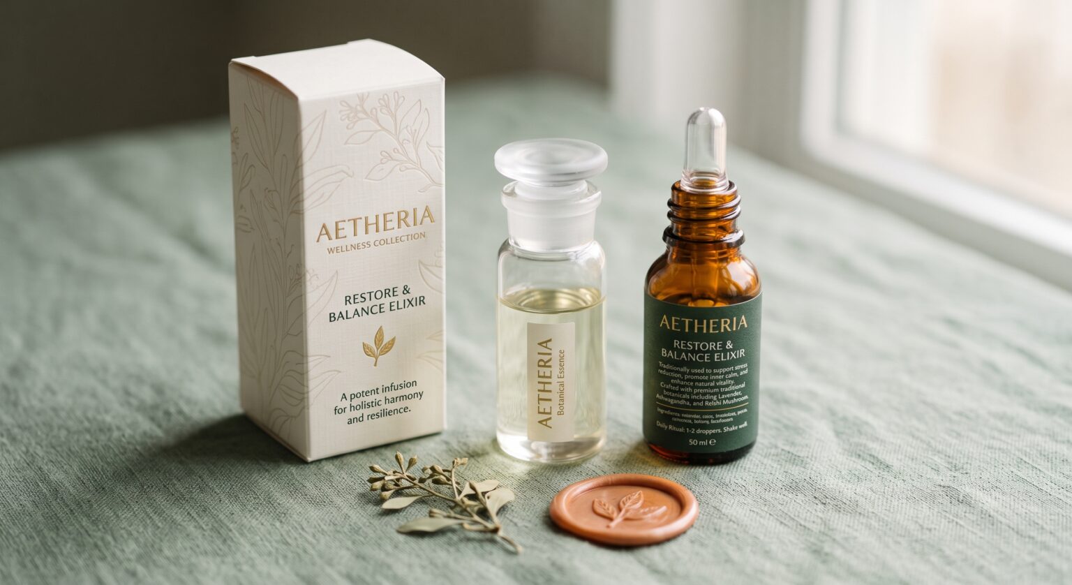
Health and beauty CPG packaging no longer gets one job. The same unit must stop a shopper on a specialty retail shelf and read as credible in an Amazon thumbnail.
September 2026 DIELINE coverage of restrained tactile luxury and playful educational packs—and BeautyMatter’s 2026 outlook on sensory, on-camera performance plus regulatory honesty—shows why clinical beauty packaging design visual trust Amazon retail readiness is now a conversion system, not a finishing touch.
This article is for founders and brand managers preparing Amazon plus specialty retail launches. It covers visual trust, retail readiness, and compliant on-pack education—not product claims that a formula treats a medical condition.
Clinical beauty packaging builds visual trust when material, color, and on-pack education work as one system: tactile restraint that feels premium in-hand, a color story that stays legible as a thumbnail, and clear education that reduces guesswork without disease claims.
Shelf presence and Amazon scroll must reinforce the same clinical-with-soul signal—calm, specific, and conversion-ready. That dual-channel bar is the operational brief for cosmeceutical and supplement launches in 2026.
Fresh DIELINE beauty cases and BeautyMatter’s 2026 packaging outlook converge on the same commercial pressure: packaging is evaluated first as a screen object, then as a physical ritual—and both moments must feel trustworthy.
BeautyMatter’s February 2026 feature argues that packaging is often seen first on a screen, so stopping the scroll is paramount, and that packs which demonstrate value and novelty instantly on camera will consistently outperform designs built only for retail shelves or DTC aesthetics. Soft-touch finishes, tactile materials, and sensory payoff are framed as conversion tools—not decoration. At the same time, the outlook stresses recyclability specificity, regulatory compliance, and radical transparency over vague “eco” language.
For founders launching into Amazon and specialty retail, that means one system of cues: what photographs well at thumbnail size must also feel considered when lifted off the shelf.
Restrained tactile luxury builds clinical trust by letting material, unexpected color, and typography carry credibility—without loud claims or cluttered illustration.
In DIELINE’s September 9, 2026 coverage, Chloe Cordover notes that a quieter kind of luxury is taking over beauty and health packaging, where material, restraint, and unexpected color matter most. Odds Studio’s work for ALAENA uses powder-blue cartons with a tactile paper finish that reads calm and intelligent while breaking from the creams, whites, and botanical greens that dominate premium skincare.
Frosted glass, silvery lids, and the warm golden tone of the formulas create contrast; no illustration is needed because color and texture become the visual language. Widely spaced ALAENA lettering feels architectural, while smaller serif copy introduces a subtle apothecary note—serene without becoming anonymous.
Quiet luxury is not “less design.” It is deliberate hierarchy: one unexpected color, one tactile finish, one apothecary typographic whisper. Those cues survive both a specialty-shelf glance and a compressed Amazon crop.
On-pack education builds trust when it replaces exclusivity theater with accessible explanation—turning the carton into a guide shoppers can decode in seconds.
DIELINE’s September 14, 2026 piece on Pluto frames perfume packaging that loosens up: simple white boxes covered with scrappy illustrations of soap, fruit, flowers, and other familiar scent references—almost like first impressions doodled onto the pack. Kateřina Milatová turns the box into a friendly scent guide that moves from what people actually smell, to how the fragrance develops, then to official notes.
The system swaps exclusivity for accessibility and shows that explaining more can make a fragrance look more interesting.
Borrow the structure, not the doodle style. Map a three-step on-pack path shoppers understand fast—what this is / how to use it / what is on the label—while keeping all language within compliant, non-disease-claim boundaries. Education that reduces guesswork is a visual-trust asset on shelf and in product-detail photography.
Clinical-with-soul packaging for Amazon plus specialty retail typically balances three levers that must agree in both channels.
| Trust lever | Shelf job | Amazon / on-screen job | Clinical-with-soul cue |
|---|---|---|---|
| Material & finish | Tactile premium feel; grip; perceived quality | Soft-touch and silhouette that still read in video and hero shots | Restraint over excess weight or foil noise |
| Color system | Differentiation from category defaults (cream/white/botanical green) | High thumbnail contrast; brand memory at small size | One signature hue + calm neutrals |
| On-pack education | Apothecary clarity; ritual steps; ingredient honesty | Scannable hierarchy in PDP images; QR/NFC for deeper proof | Explain more; claim less |
BeautyMatter’s 2026 experts reinforce the same split: differentiation is being concentrated in high-impact areas such as application, color, and on-camera performance, while systems simplify elsewhere. Lightweight luxury is shifting prestige toward textured surfaces and specific silhouettes rather than heavy, layered packaging.
Smart packaging (QR, NFC, RFID) is positioned for education, usage guidance, authentication, and post-purchase engagement—useful when the physical pack cannot hold every proof point. For cosmeceutical founders, BeautyMatter also notes that the line between clinical treatments and everyday skincare packaging expectations continues to blur—precision applicators and ritual-forward formats signal care and control. Signal careful formulation presentation; do not imply the pack or product treats a medical condition.
Growth-minded retail readiness means stress-testing the same artwork against shelf distance and thumbnail crop before you lock tooling.
- Thumbnail test. Shrink the front panel to Amazon search size. Does the brand mark, hero color, and one education cue still parse in under two seconds?
- Shelf adjacency test. Place the mock beside category defaults (cream, white, botanical green). Does your color/material story still feel calm and intelligent—or does it disappear?
- Education hierarchy. Primary panel: identity + compliant use cue. Secondary panels / QR: deeper sourcing, recycling specificity, or ritual steps—aligned with BeautyMatter’s call for verifiable sustainability language over vague green claims.
- On-camera ritual. If the pack dispenses, opens, or applies on TikTok Shop or live commerce, design the motion payoff (click, glide, reveal) deliberately—BeautyMatter frames this as a sales conversion driver in 2026.
- Regulatory honesty pass. Specific recycled-content language, mono-material intent where relevant, and accurate claims only—matching the 2026 push toward transparency, EPR-aware design decisions, and data-backed packaging composition.
Afaque Designs approaches health and beauty CPG packaging as clinical with soul—PharmD-informed restraint on what the pack may imply, paired with growth-strategist rigor on conversion and retail readiness. If you are preparing an Amazon plus specialty launch, packaging design services that unify material, color, and on-pack education into one visual-trust system are how quiet luxury and apothecary clarity become shelf- and scroll-ready—without inventing medical claims.
Because shoppers often meet the pack on a screen first. BeautyMatter’s 2026 outlook states that packaging is frequently seen first on a screen and that packs designed to demonstrate value instantly on camera will outperform shelf-only aesthetics—so founders need one system that holds up in both contexts.
It is restrained premium signaling through material, unexpected color, and typography rather than loud illustration or claim stacking. ALAENA’s powder-blue tactile cartons, frosted glass, silvery lids, architectural lettering, and subtle serif apothecary copy—covered by DIELINE in September 2026—are a clear example of serene, intelligent presentation.
By explaining what shoppers will experience and how to use the product in plain, accessible steps—similar to Pluto’s scent guide that moves from familiar impressions to development to official notes—while keeping disease-treatment language off the pack. Education reduces guesswork; it does not diagnose or promise clinical outcomes.
Tactile paper finishes, frosted glass, controlled metallics, soft-touch surfaces, and silhouettes that feel precise rather than heavy. BeautyMatter’s 2026 “lightweight luxury” trend favors textured surfaces and specific shapes over excess weight, while still supporting sensory and on-camera performance.
Choose a signature hue that breaks category defaults and stays legible at thumbnail size, then support it with calm neutrals. ALAENA’s powder blue, for example, is described as breaking from cream, white, and botanical green dominance in premium skincare—useful as a differentiation lesson, not a palette mandate.
Per BeautyMatter: sensory and on-camera performance, specific and honest sustainability language, precision application formats where relevant, smart packaging for education and authentication, and operational simplification that concentrates differentiation where it drives conversion—color, application, and screen performance.
Before tooling and photography lock. Thumbnail contrast, shelf adjacency, education hierarchy, dispensing ritual, and compliant claim review are cheapest to fix in design—and most expensive after inventory is printed.